Amidst all festivities and exams I didn’t get the chance to do a lot more evaluations. However, I didn’t stop working on the prototype. Due to the lack of evaluations, there wasn’t really much I could justify changing contentwise but I could increase the quality of the prototype altogether by making it more consistent and interactive.
Consistent margins, graph dimensions, etcetera do not only make the prototype look cleaner and closer to a hypothetical final product but it will also provide a convenient manual for the implementation.
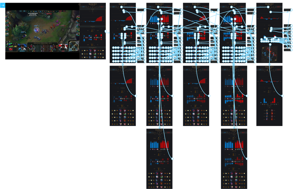
It was a pleasure to discover that Figma (the prototyping tool I’m using) supports interactivity quite well, even though the picture of the interactive prototype below kind of looks like a messy cobweb. Users can click on elements to bring up some information that would be available by hovering over the element in the final product. They can also toggle switches and checkboxes in order to change some visualisation aspects.
Only the general team overview has undergone noteworthy changes and these will be addressed in the following paragraph.
General team overview
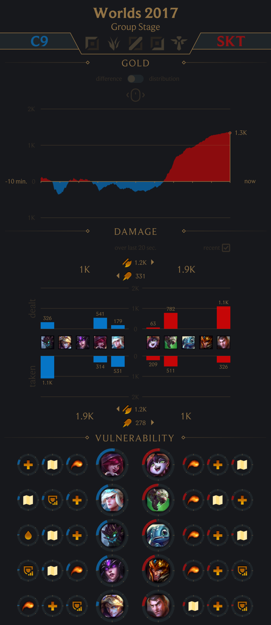
As can be seen above, some visualisations got merged to save some critical vertical space in the sidebar. Users can use the toggle switch to alternate between two visualisations or tick the checkbox to alter the content of visualisations. The effects of using the toggle switch and ticking the checkbox off are displayed on the left in the picture below.
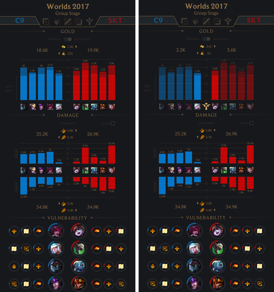
Users are also able to highlight areas of the visualisations which effects in altering the shown content in that visualisation. This effect is displayed on the right in the picture below.
Gold
The previous prototype showcased a separate gold difference and gold distribution visualisation. Since these two visualisations are presenting different aspects of the same statistic, it made sense to merge them into one visualisation and allow the user to switch between them freely.
The gold distribution now includes a subtle hint on the side on what the different bar segments portray. Bars can also be highlighted to show more specific statistics about a selection of the players.
Damage
By mistake, the previous prototype didn’t include a visualisation to see the damage over the entire game anymore. Now users can use the same visualisation for this and tick the checkbox to only see the recent damage.
A tester suggested that damage taken is more important for some roles than damage dealt. Therefore, this prototype includes them both.
Evaluation
The new prototype is ready to be tested and this will likely result in more content and clarity changes in the next, hopefully final prototype. Thereafter, the quality of the final prototype will be verified by the Reddit community.