A last improvement is adding some interactivity to the sidebar. Spectators can hover over virtually anything for further clarification or more detailed information.
When users run into an unknown icon, the first instinct will likely be to hover it with their mouse. As such, tooltips are an excellent way to inform novice users whilst not bothering the more experienced ones.
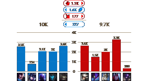
Another use case for tooltips is to provide more detailed information on demand without cluttering the interface. When hovering a team’s or player’s total damage, the tooltip contains the share of each damage type. In the gold distribution bar chart, the tooltip specifies the exact amount of spent and inventory gold.

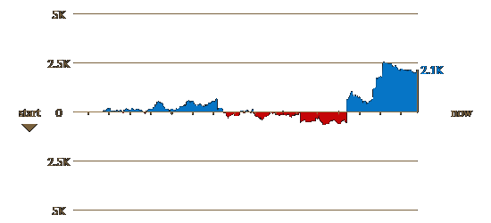
The x axis of the gold difference visualisation doesn’t specify exact times. It can also be rather hard to estimate the exact amount of gold difference at a certain point. Therefore, users can hover this visualisation to get this information.
The roles of the players in the bar chart are not really demarcated. Hovering highlights players of the same role for a comparison and also changes the summary above to show the differences between these two.
Additionally, the sidebar can now be toggled with a hotkey. It is also made responsive for mobile devices on which only the sidebar is shown. Accordingly, users can combine watching the stream on a television screen and having the visualisations on their smartphone for easy interaction.
The video below shows off the complete prototype. The last thing to do is make this prototype public. In that way I can hopefully get some more reliable quantitative feedback.