With the results of the previously mentioned studies, I went to the drawing board. Well, for as long as my perfectionistic brain could live with the sloppily drawn visualisations on paper, that is. My mentor recommended me this free design tool, Figma, so I went ahead to try it out before even finishing my first prototype on paper. It proved really easy to use and my visualisations suddenly were way more pleasant to look at.
After heavily investigating the house style of Riot Games, I made my design look semi-Rioty. First of all, I’m a big fan of their clean, yet themed design and second of all, it kind of makes it look more professional as well.
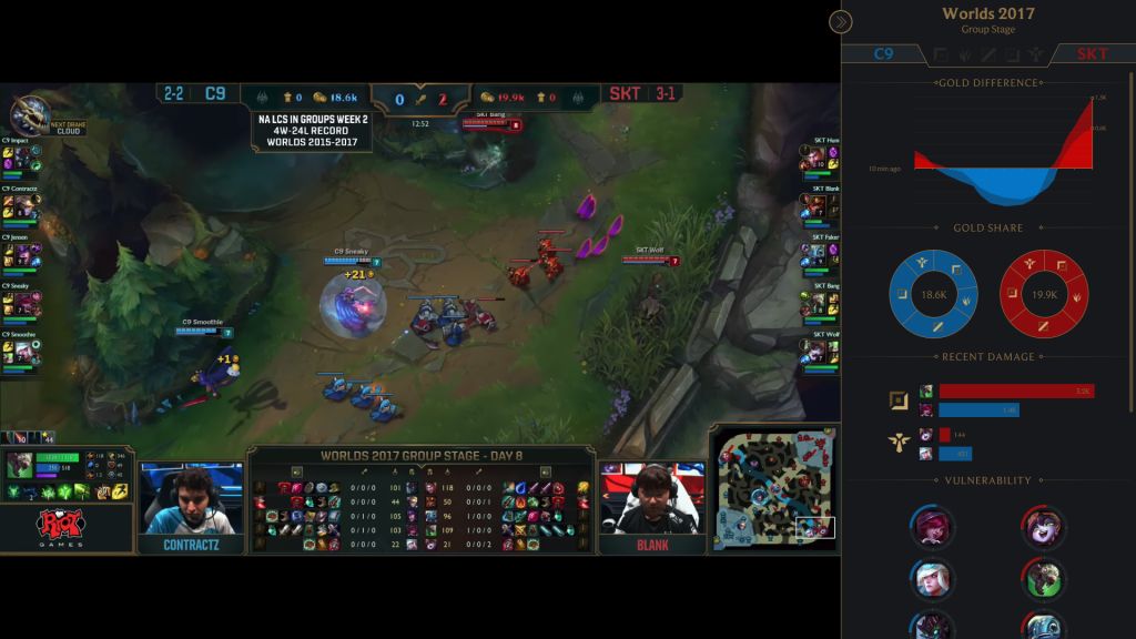
So without further ado, we’ll zoom in on the sidebar to take a closer look at the content of the first prototype.
Let’s just go from top to bottom as not to get ahead of ourselves.
The first interesting thing that pops up are the greyed out role icons in the header. These are meant to switch between a general team overview as currently seen here, and a more role specific comparison. We’ll cover the latter later.
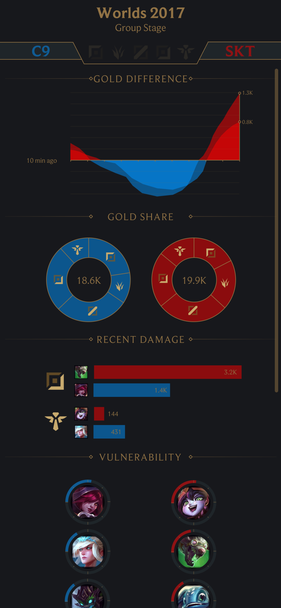
General team overview
Gold difference
The studies indicated that gold is one of the most useful team statistics, as was to be expected. The gold difference between two teams is therefore useful to judge which team is currently ahead. In the visualisation, this difference is shown in function of the game time so spectators can clearly see how the actions in-game influence the gold difference over time. The two different shades of the team colours represent the difference between the gold that has been earned by the team and the gold that has already been spent, which is a subtle difference. However, this can make a world of difference in a team fight when one team is fully geared up on items and the other team is still stuck with all their gold in their pockets. Hence, the difference in gold spent arguably gives a more accurate estimation of the current power of both teams. The difference in gold earned is still valuable too though, as it gives spectators insights into the future power of both teams.
Gold share
Different teams distribute their gold over their team members in their own way. The gold share visualisation means to give a broad overview of this distribution.
Recent damage
Currently, damage dealt to champions in the last teamfight sometimes gets displayed on the stream after a major teamfight. This information comes in pretty late though and it could be useful to have this during the teamfight itself as it shifts your focus to the most performing team member in terms of damage. The user study indicated that spectators found it more useful to know the damage dealt to champions in a single teamfight than during the entire game. However, it’s useful to provide both so the damage dealt to champions during the entire game will be available in the role specific comparison. This will allow spectators to compare the performance of a player in a certain teamfight to their performance in the entire game.
Vulnerability
The final visualisation in the general team overview is a bit dissimilar from the other ones since it doesn’t show a traditional in-game statistic but rather is based on a whole lot of in-game statistics. The objective is to show spectators which players are currently the most vulnerable. Factors that could be used to determine the vulnerability of a player were questioned in the user study as well. Some of the most important ones include: current health, mana, defensive summoner spells being available, their position on the map (distance from team members, enemies, friendly turrets, base, …) and defensive stats of the player. A well-tuned formula should be able to put a number on the vulnerability of a player and provide a ranking of the players according to their vulnerability score.
Role specific comparison
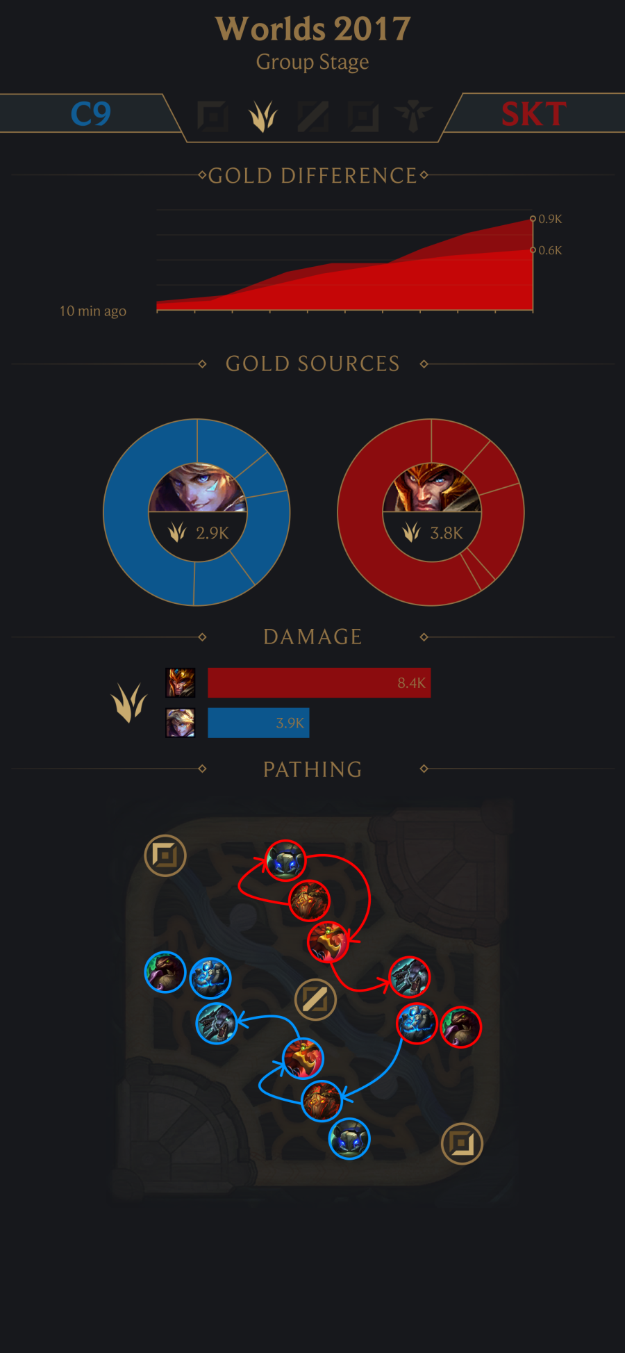
In this example, the jungle role is selected in the header. The gold difference visualisation now shows the gold difference between the players of that role on each team and as said before, the damage visualisation now shows the damage dealt to champions throughout the whole game.
Gold sources
An additional visualisation shows where the gold of a player comes from. Sources include champion kills/assists, killing minions, killing jungle monsters, destroying enemy structures and miscellaneous sources.
Pathing
The user study indicated that the pathing of the jungler is really important in the early game but is relatively hard to keep track of while still paying attention to the game in general. A visualisation showing the recent pathing of the jungler between jungle monster camps and lanes could therefore help the spectator tremendously.
Evaluation
This first prototype will be evaluated with experts, both in the data visualisation scene as in the League of Legends (esport) scene. Based on their feedback, I will produce a second iteration of the prototype soon.